Chart - Configuring range for X-axis

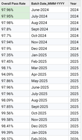
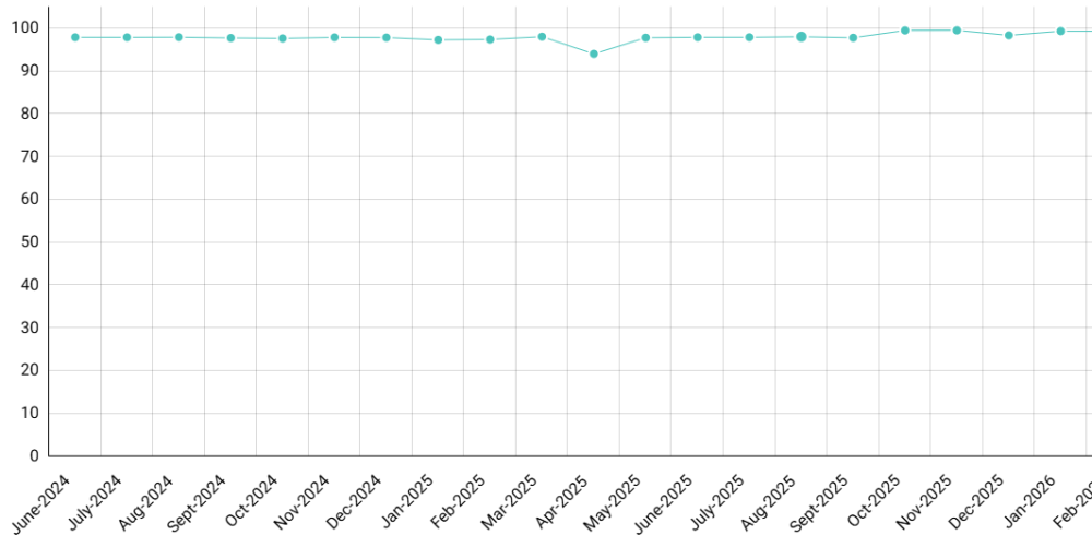
Hi all, I have the below dataset used as a source for a timelapse chart. Data set and chart below.
Now, I want to pivot the tables and group by Year, but when I do that, the X-Axis shows categories not related to that year and I want t to show only the related categories in the X-Axis.
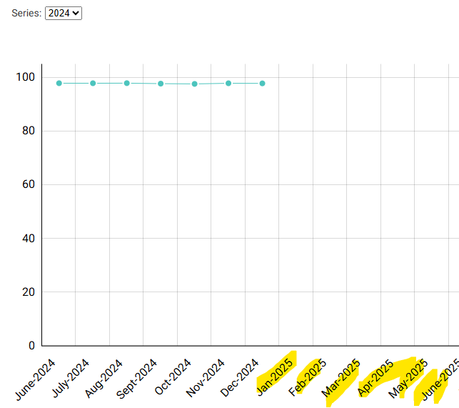
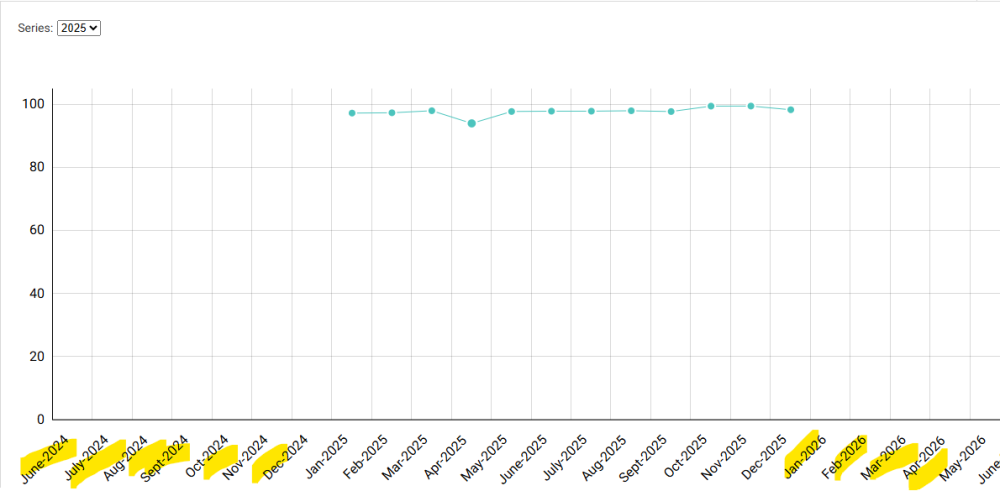
Is there a way, Without having to use a different dataset, to remove those unwanted highlighted categories from the X-Axis?
Thanks
Answers
-
Hello
Yes the filter is being applied to the data and not the axis. This is specific to way the charts plot dates, so that if you have a point (month in this case) in the series missing from your data then it will show clearly that it is missing rather than a smooth line.
If you click and drag on the chart then it will zoom in to show only the x-axis area you selected.
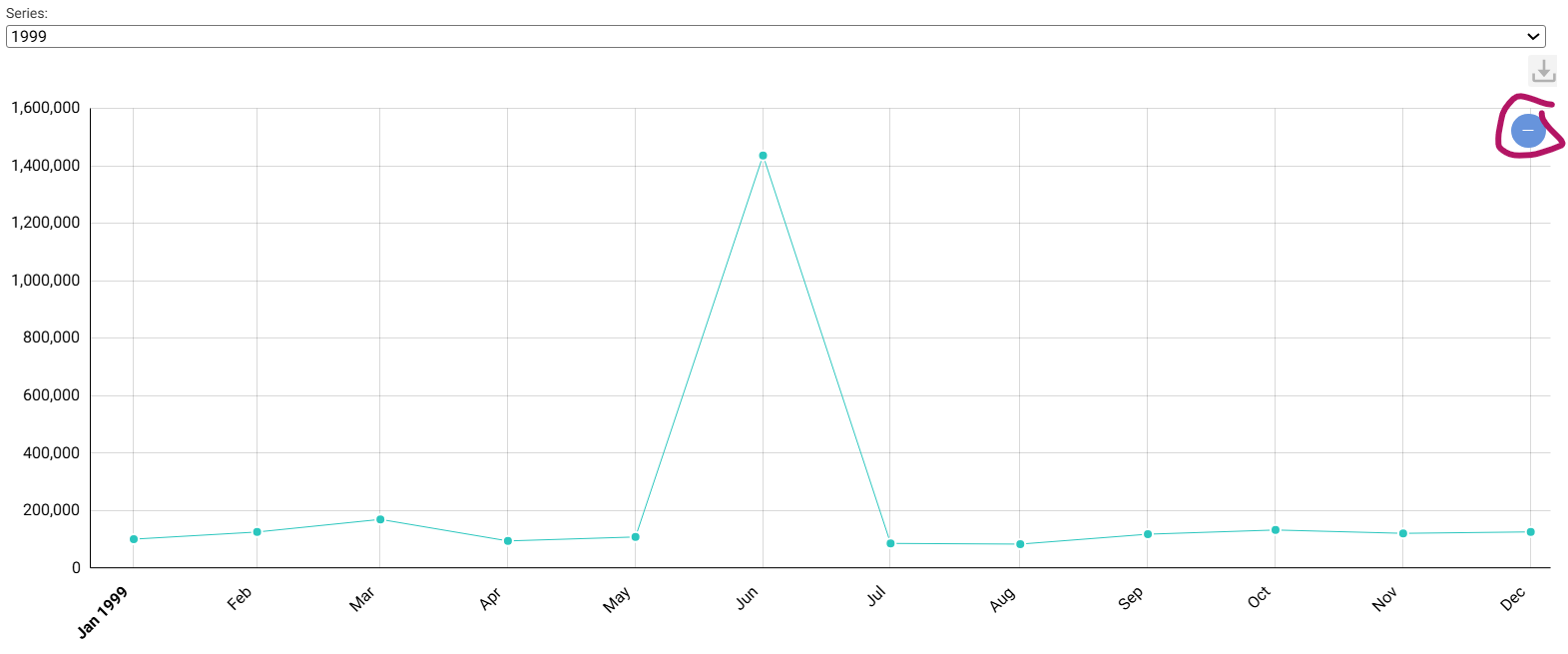
You could group by your Year column if this helps to show the distinction with different colors: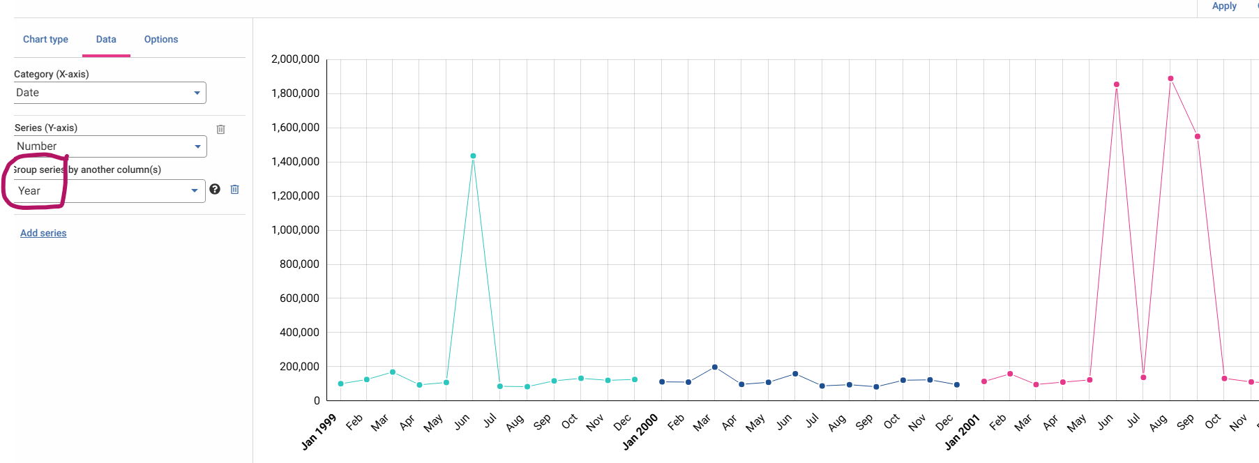
Alternatively yes you would need to clone the Chart/step and apply the filter before the chart step
1