📊 New chart types

With an increasing number of users now spending more and more time building (and then interacting with) charts and dashboards, there are a couple of additional requests I'm hearing cropping up relating to this so I'm posting them on here for discussion and to get the wider Community's thoughts.
They are:
- Adding some new types of charts, specifically Venn diagrams to help present matching results when highlighting where customer/party data records that have been joined together originate from:


- And dual-axis charts to allow different data points to be presented against the same series of values (E.g. sales and profitability by county) on the same chart:

- Beyond these there have also been requests for dashboard-level filters that impact multiple different charts (e.g. so the same dashboard can be used by different users with simply a filter at the top to allow them to only see the data that is important to them e.g. fitler by country/department/product etc). Like the below examples from SalesForce:

What do you think? Are these ideas that get your vote? Do you have other suggestions for enhancements to the dashboard/charting capabilities? Let us know with you votes and comments below 😊
Comments
-
@Marco_13112001 did you want to add any further thoughts as I know this was something we discussed at the User Group event a couple of weeks ago?
0 -
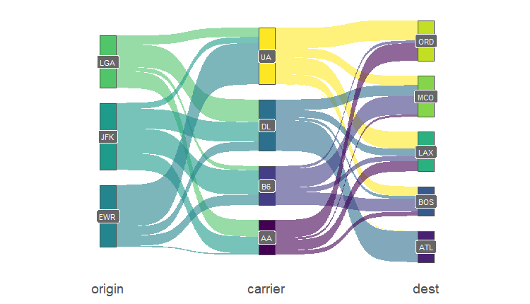
Venn diagram would be great. Another option that would be useful for when you want to compare 5+ variables with each other and highlight the stronger relationships are:
* Sankey/alluvial diagramhttps://www.bioinfo-scrounger.com/data/photo/flight_sankey.png
*Chord diagramhttps://www.streetlightdata.com/chord-diagrams-visualization-data/
I see this being useful for reviewing duplicate results and showing what source systems have a stronger relationship with each other vs systems which don't.
1 -
@Danny Roden Apologies for the late reply. Only a couple of additions to your suggestions, the ability to create charts from workflows and more flexibility when setting the size of the charts on the dashboards.
1 -
I like the universal filter option. I do something like that now on an external dashboard.
0 -
Universal filters would be great, current workaround is to have users run a workflow that changes the filer across all data inputs.
I also use an additional UI building tool and they introduced enhanced charts would love to see more of these. Think they use plotly 1
1


