Make Your Data Pop: Visual Styling in Aperture Data Studio

Allow your data to speak for itself - Aperture Data Studio offers powerful ways to make your results more visual and intuitive, perfect for quick reviews and better decision-making.
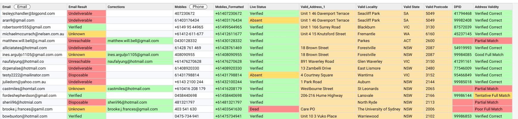
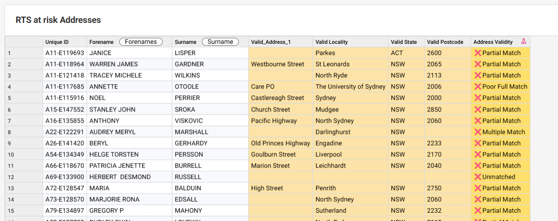
1. Set Cell Style for RAG Colour Coding
The Set Cell Style function lets you apply a Red-Amber-Green (RAG) overlay to cells based on business rules.
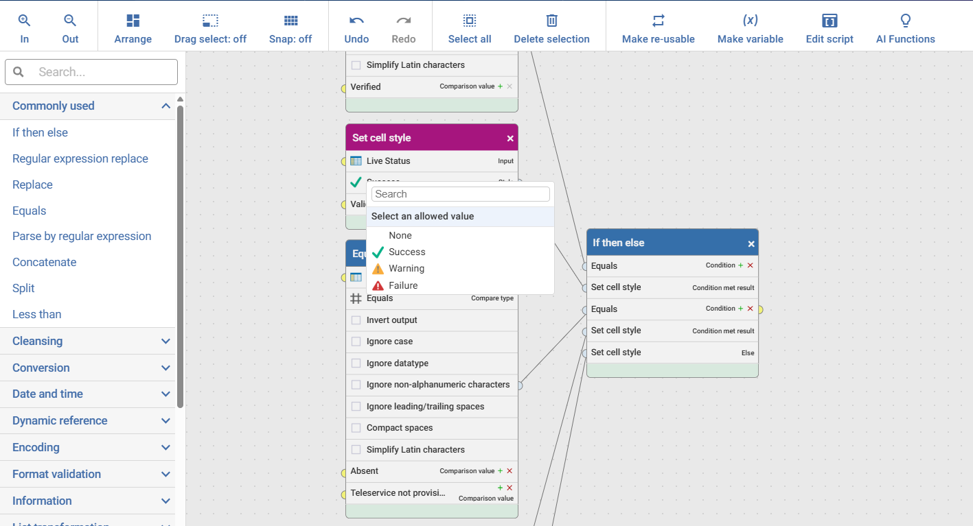
Example: When validating addresses, you can colour-code results so valid addresses show green, questionable ones amber, and invalid ones red. This instantly draws attention to what matters most - no more scanning through rows of text.
2. Add Emojis for Extra Clarity ✨
Go beyond colour coding by using emojis - with the shortcut Windows key + period (.), you can insert icons like ✅ ❌ ⚠️ directly into your data or dashboards.
Combine this with RAG styling for a quick visual cue that makes your outputs more engaging and easier to interpret.
Why bother?
Visual cues reduce review time, highlight issues faster, and make dashboards more user-friendly, especially for stakeholders who prefer quick insights over raw data.
*all information shown is demo dummy data